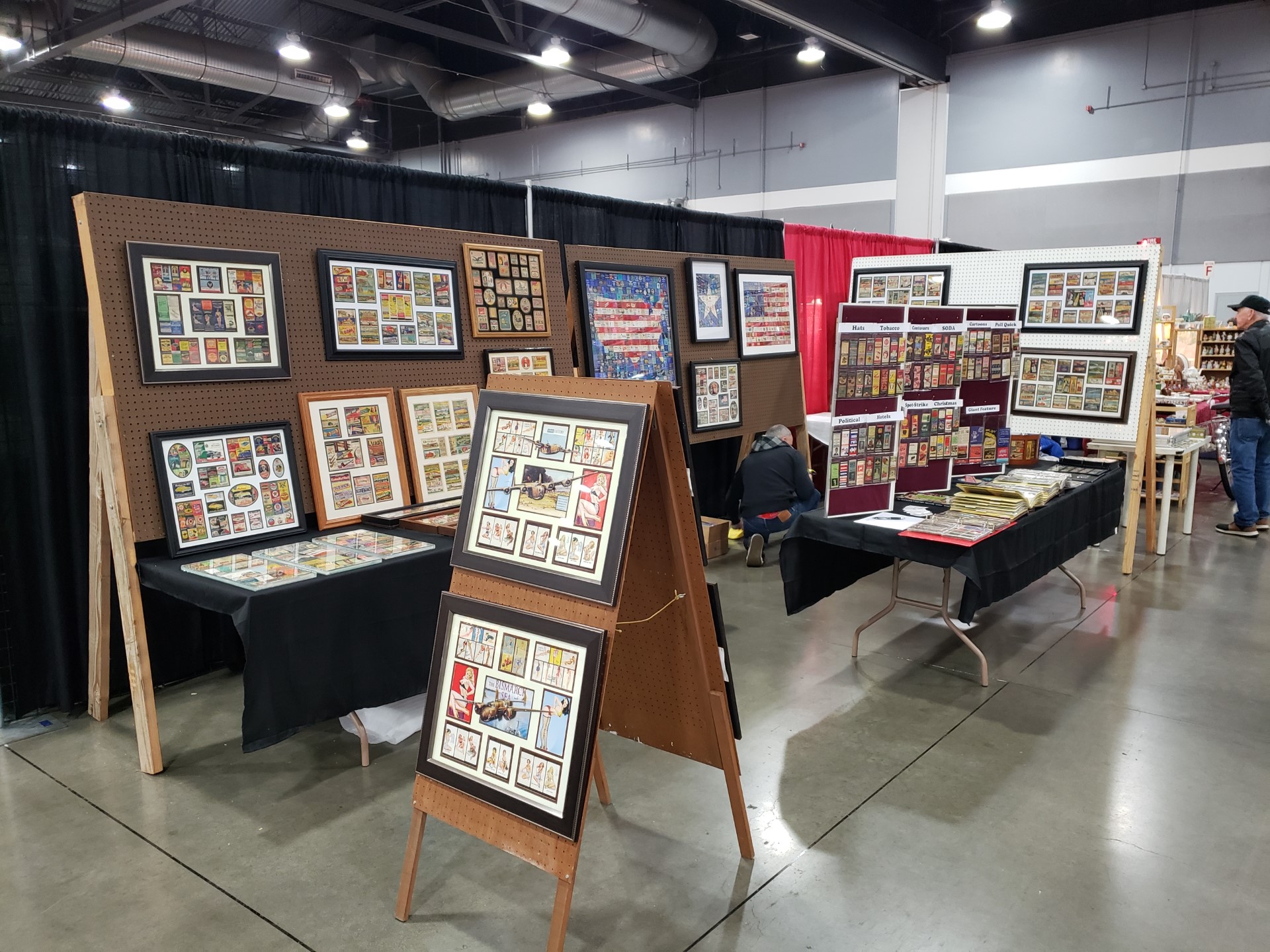
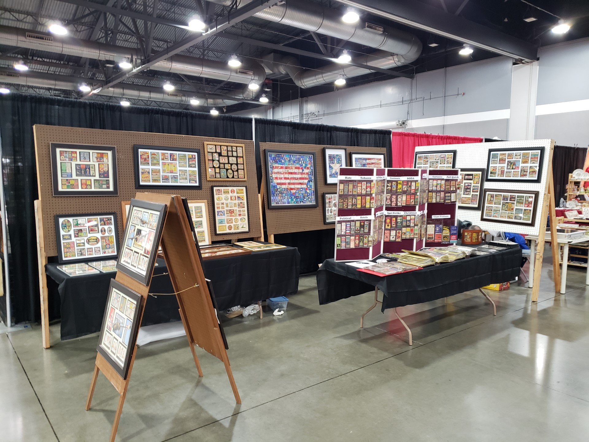
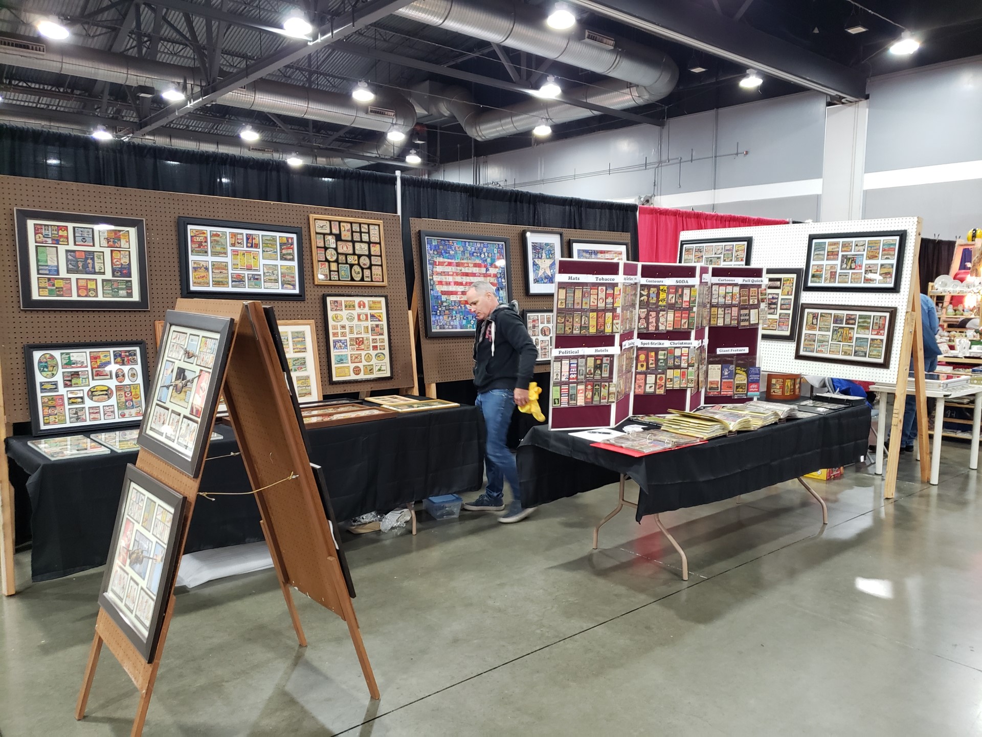
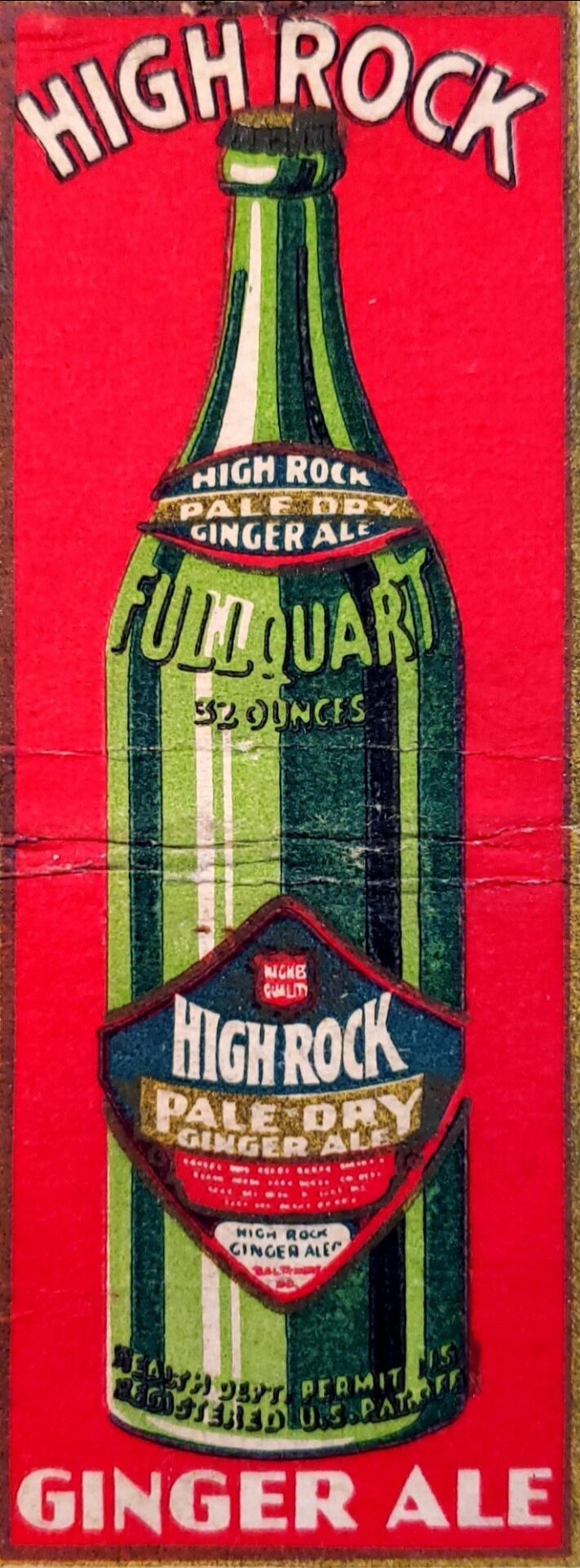
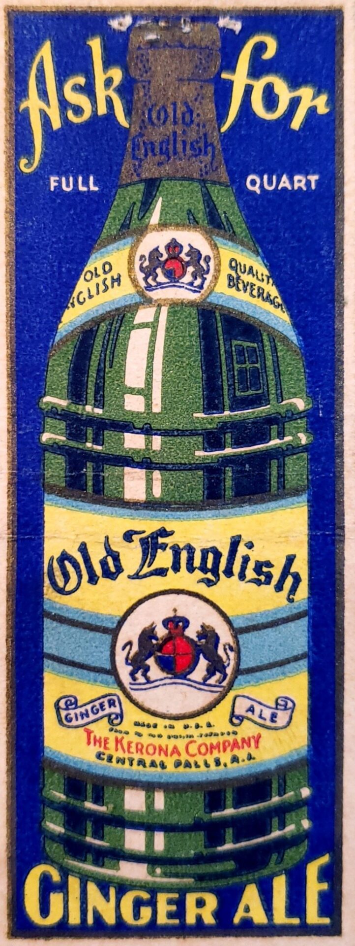
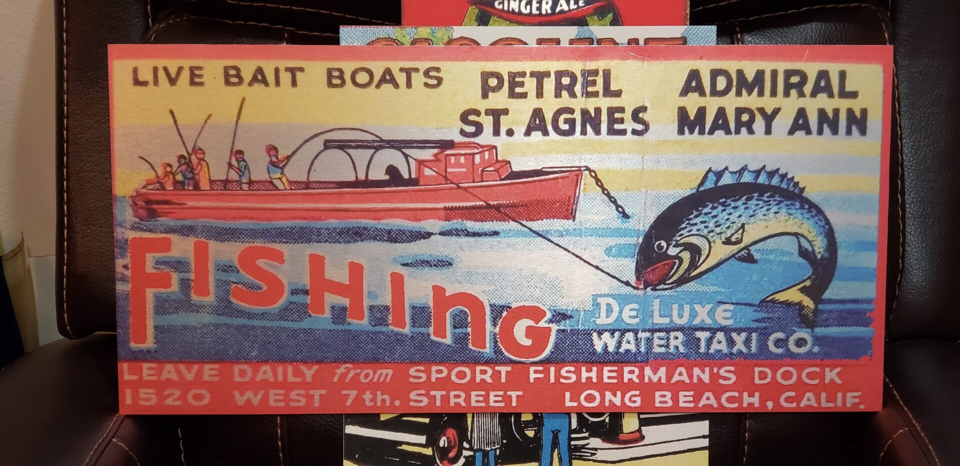
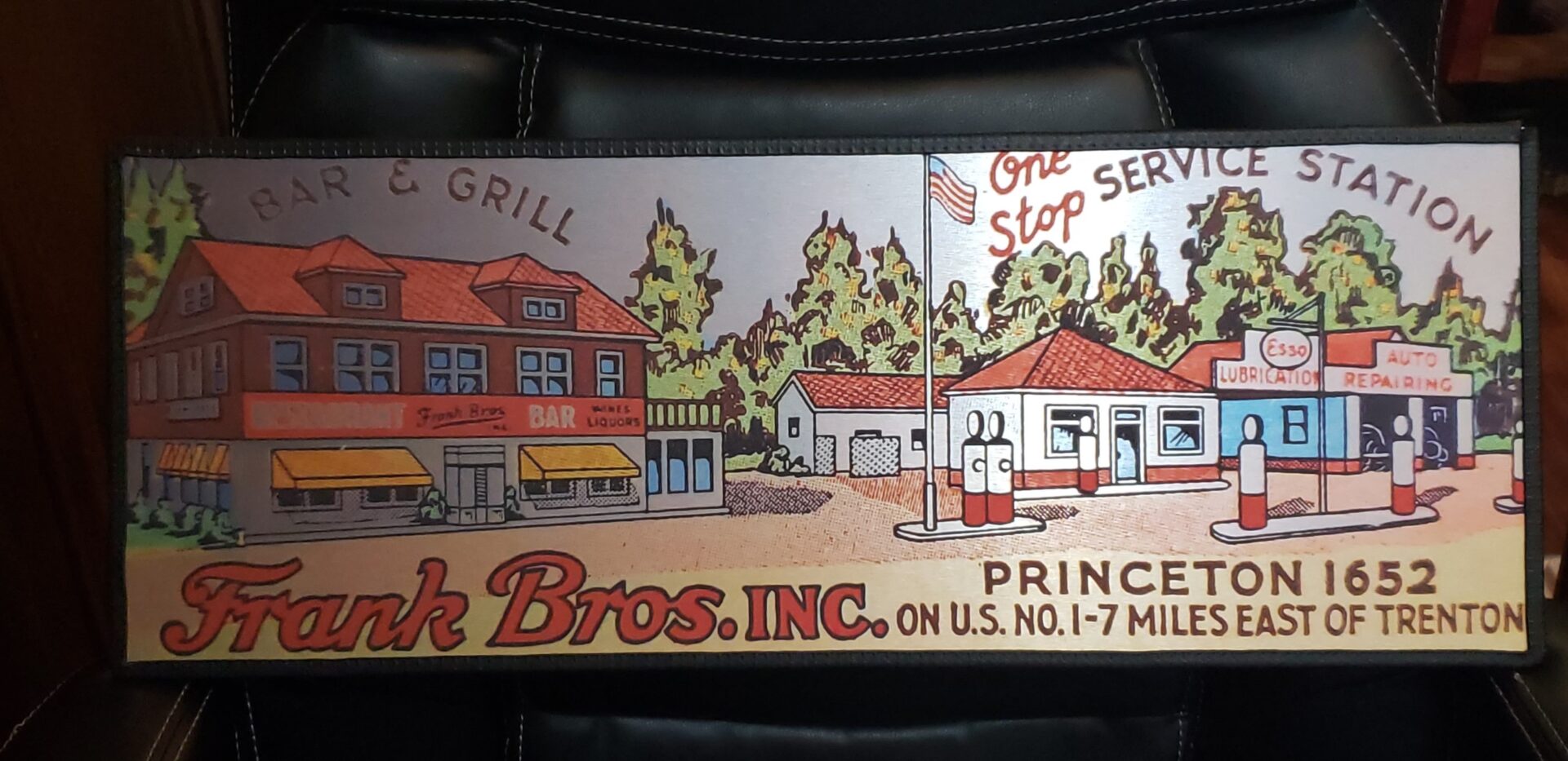
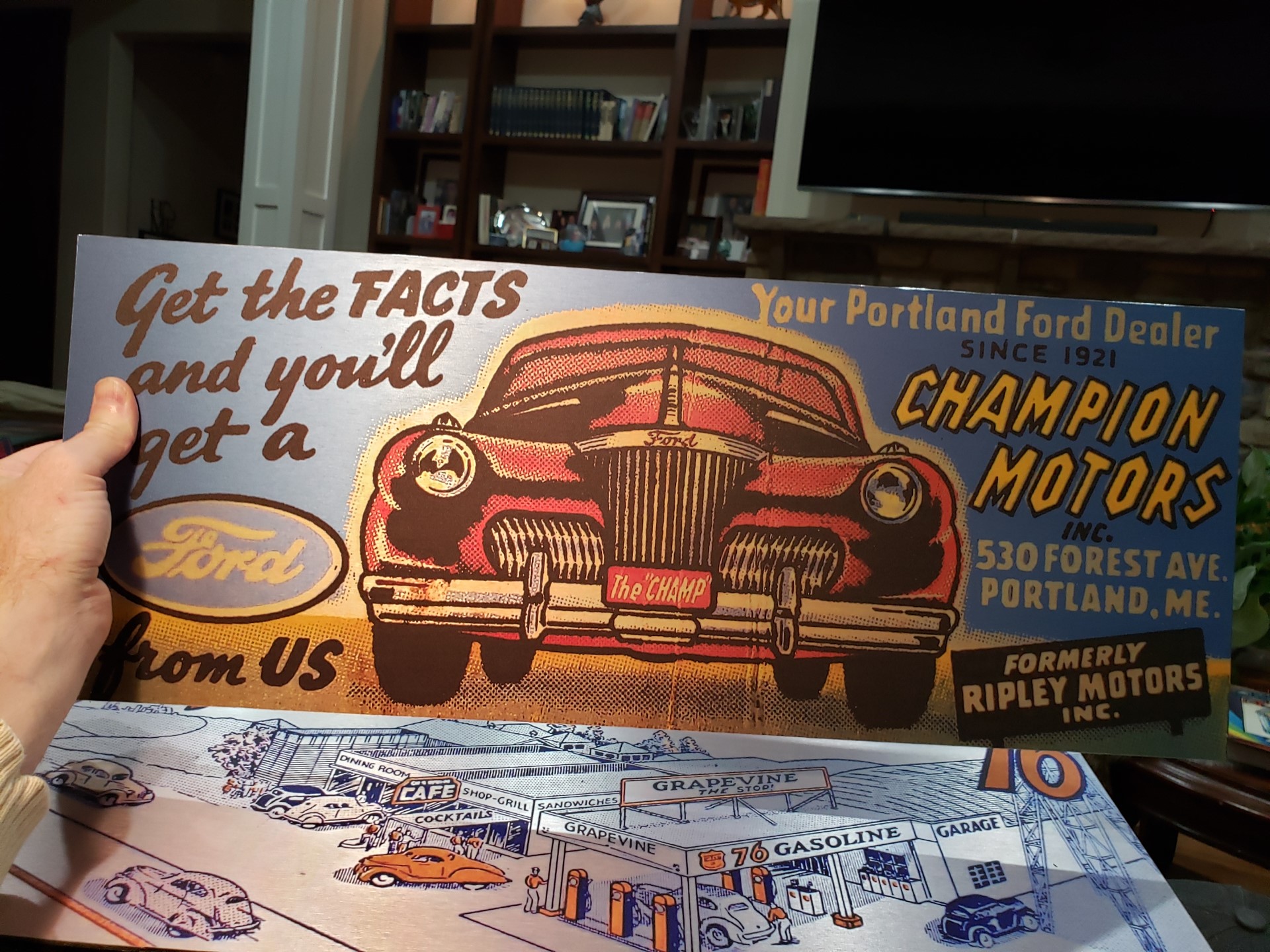
Like so many collectors, for Dave the sickness set in about the time he was 9-years-old. He discovered and fell in love with the art of matchbook covers. Tiny masterpieces, much like stamps, matchbook covers offer a seemingly endless array of images, stylish type fonts, topics, and colors.
“The collection began out of a love of design,” he said. “In particular, I found I have a large interest in the matchbook covers from the 1930s, ’40s, and ’50s. Right around 1960, printing and paper technology changed, and with it so too did many design themes, the overall language became very different.”
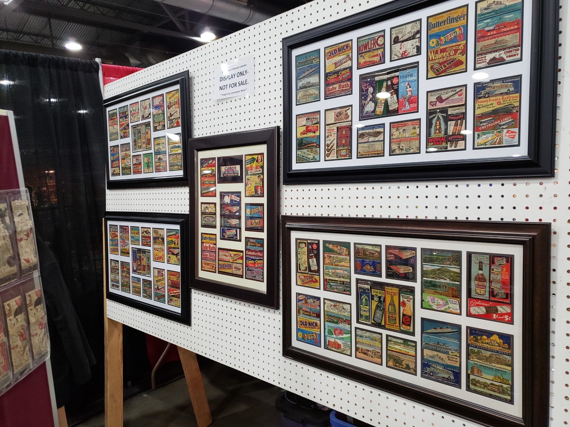
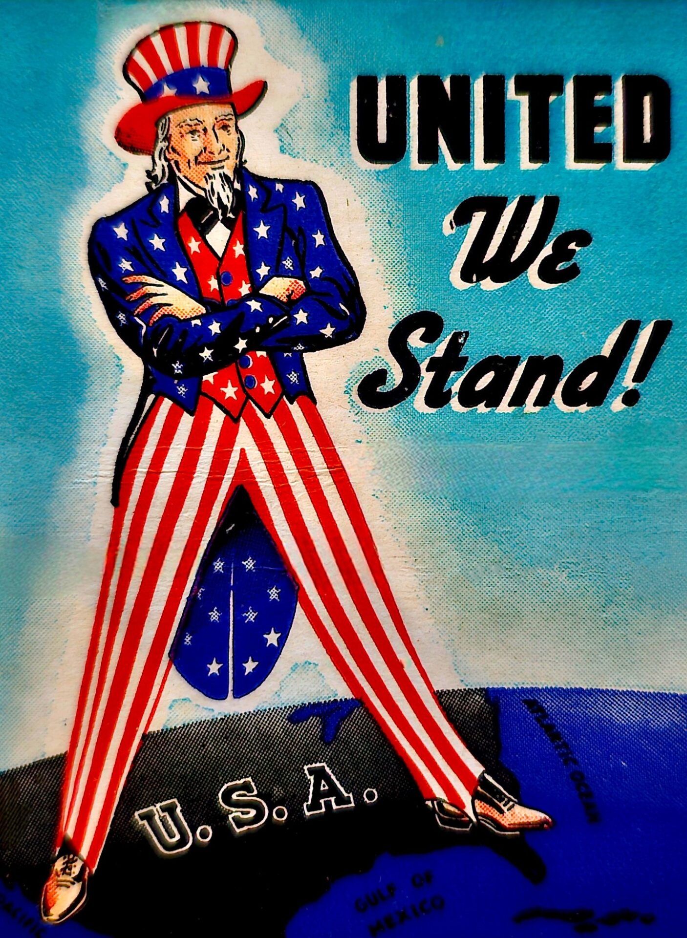
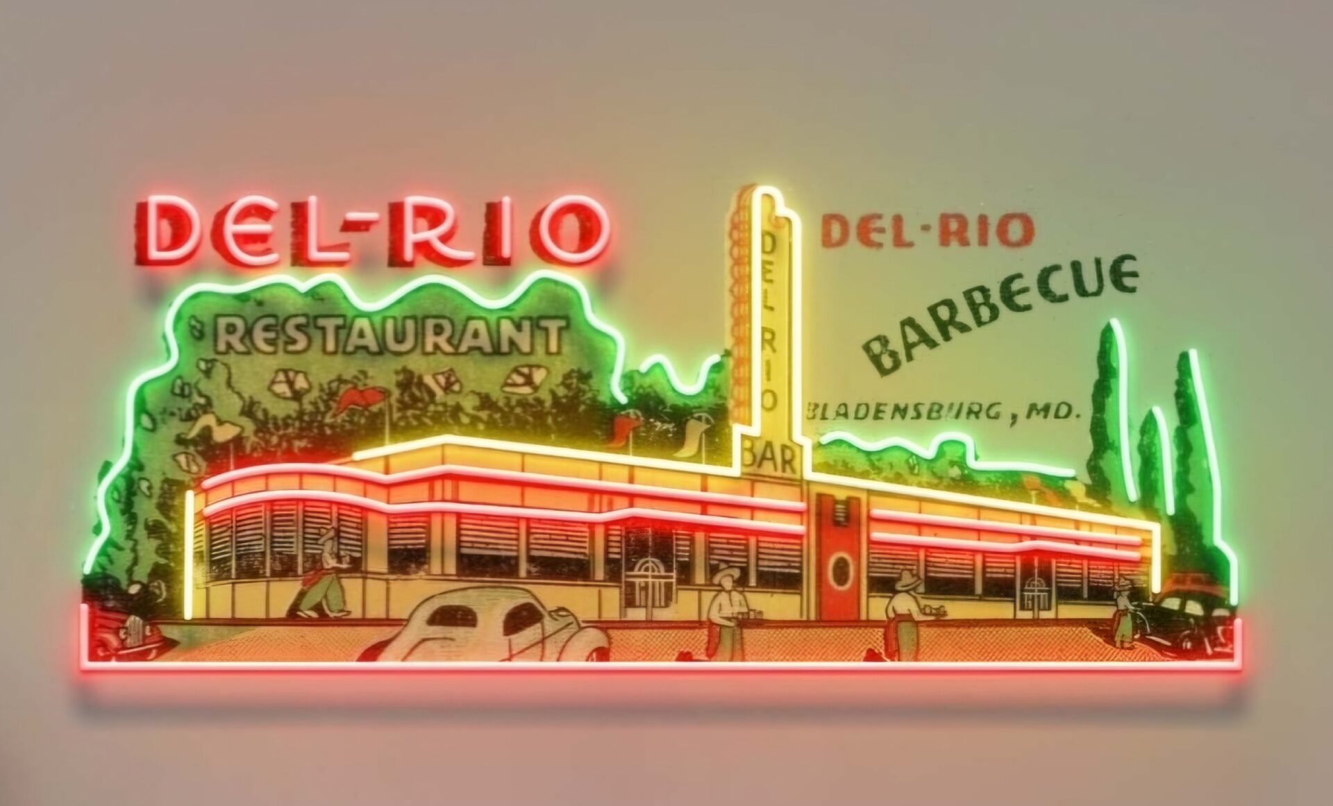
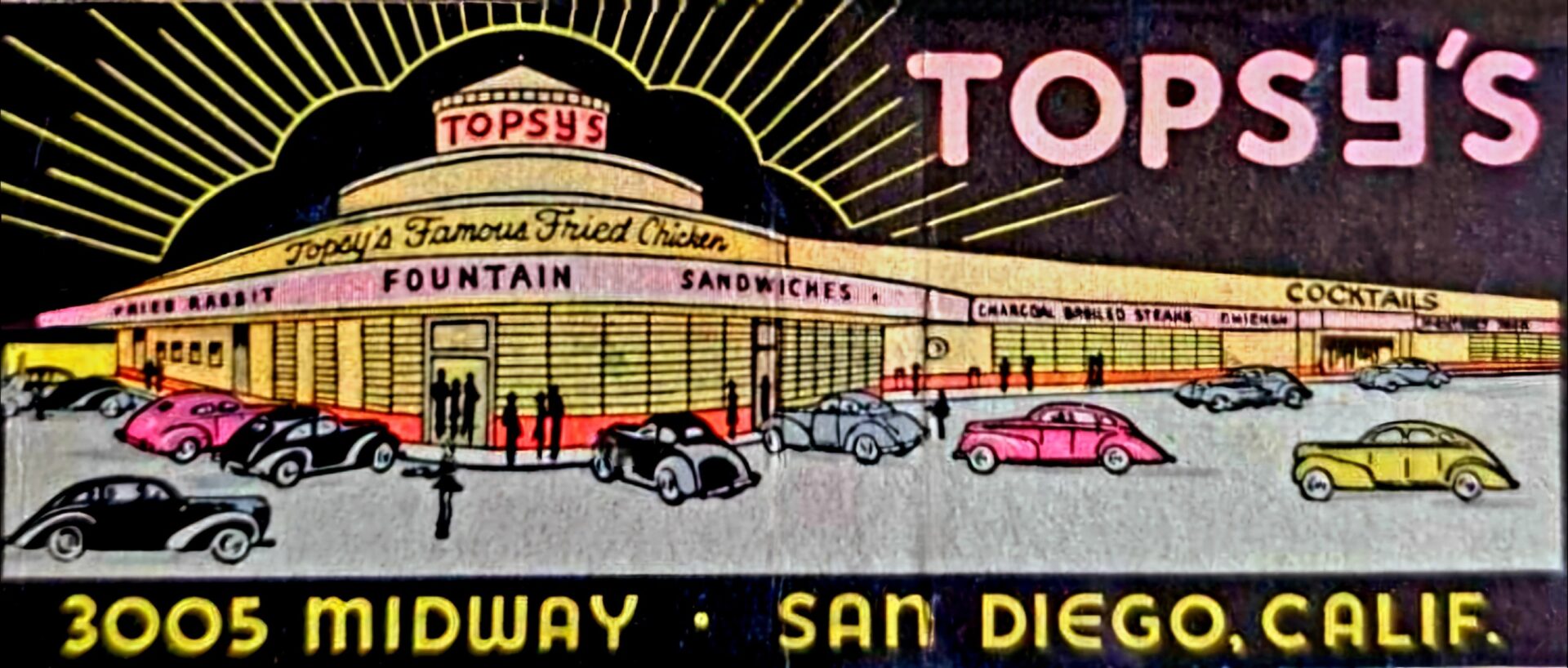
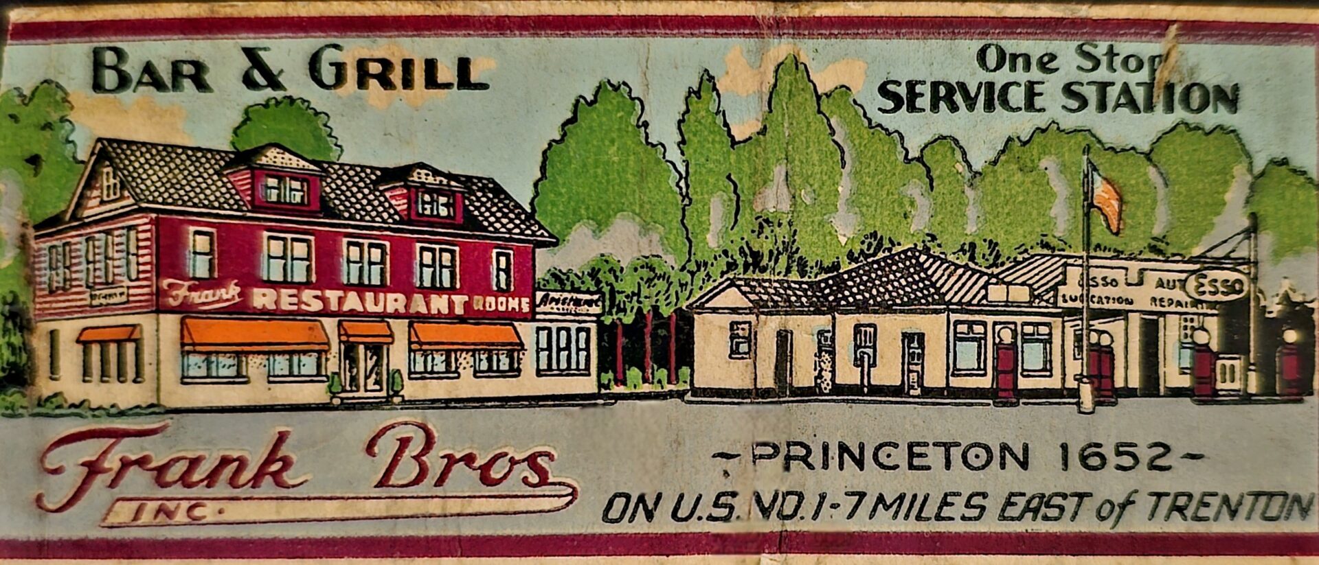
With the onset of the Great Depression, and later World War II, art became an uplifting media, something to elicit feelings of optimism and hope, particularly within the realm of commercial advertising and promotional products. Matchbook covers could easily sustain positive messages, literally by the millions, thanks to their size. In 1929, a printer in Chicago, Illinois perfected a method of printing on small medium such as postcards and matchbook covers. Using a unique combination of coarse paper, exaggerated perspectives, and color, the new renditions and its unique printing process resulted in very vivid colors. The resulting imagery appeared with lines, much like that of printing on canvas, creating a unique “linen” look as they became known. Add to this the colors that were en vogue at the time, mostly simple reds, greens, and blues, and the overall scene can be mesmerizing and surreal, similar to a dream-like cartoon world to the viewer.
“Tourists and often traveling salesmen would take pictures of cafes, gas stations, train stations or motels and these would be re-touched by artists into the version printed onto postcards to be sent to friends and family around the country,” Dave said. “This evolved into using the art printed on matchbook covers, which was challenging due to the size of the matchbook. The manufacturers figured out a method in which to print them while maintaining spectacular registration and colors. On top of that, the ‘linen’ look gave it the vibrant color and vision depth.”
This method would become very popular and matchbook history was onto another chapter.
“This was when people first started to see those places, cafes and gas stations and whatnot, illustrated on matchbooks,” he said. “It was terrific for advertising a place or business, they were cheap promotional pieces, and people would carry them all over the country in many instances.”
The challenges in phillumeny (pr: fill-ou-meny), or the hobby of collecting match-related items, are very real, according to Dave.
“It’s a constant struggle against moisture, rusting staples, oils from the skin, and simple damages such as tears and scratches and even fading,” he said. “So, it’s important to adhere to proper storage and handling techniques to ensure preservation and longevity.”
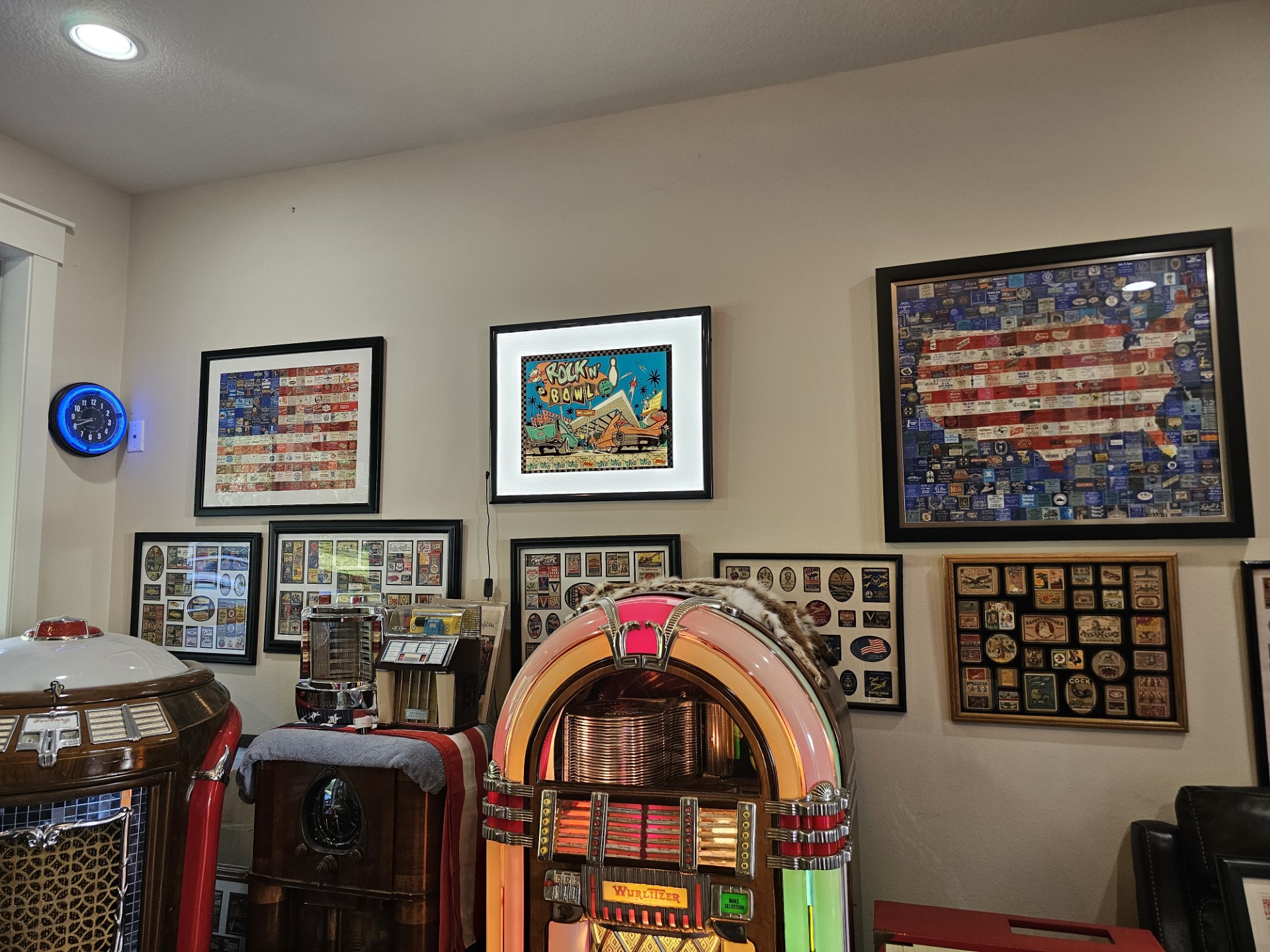
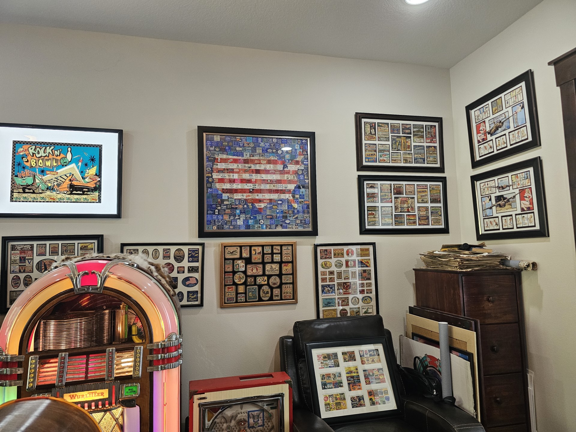
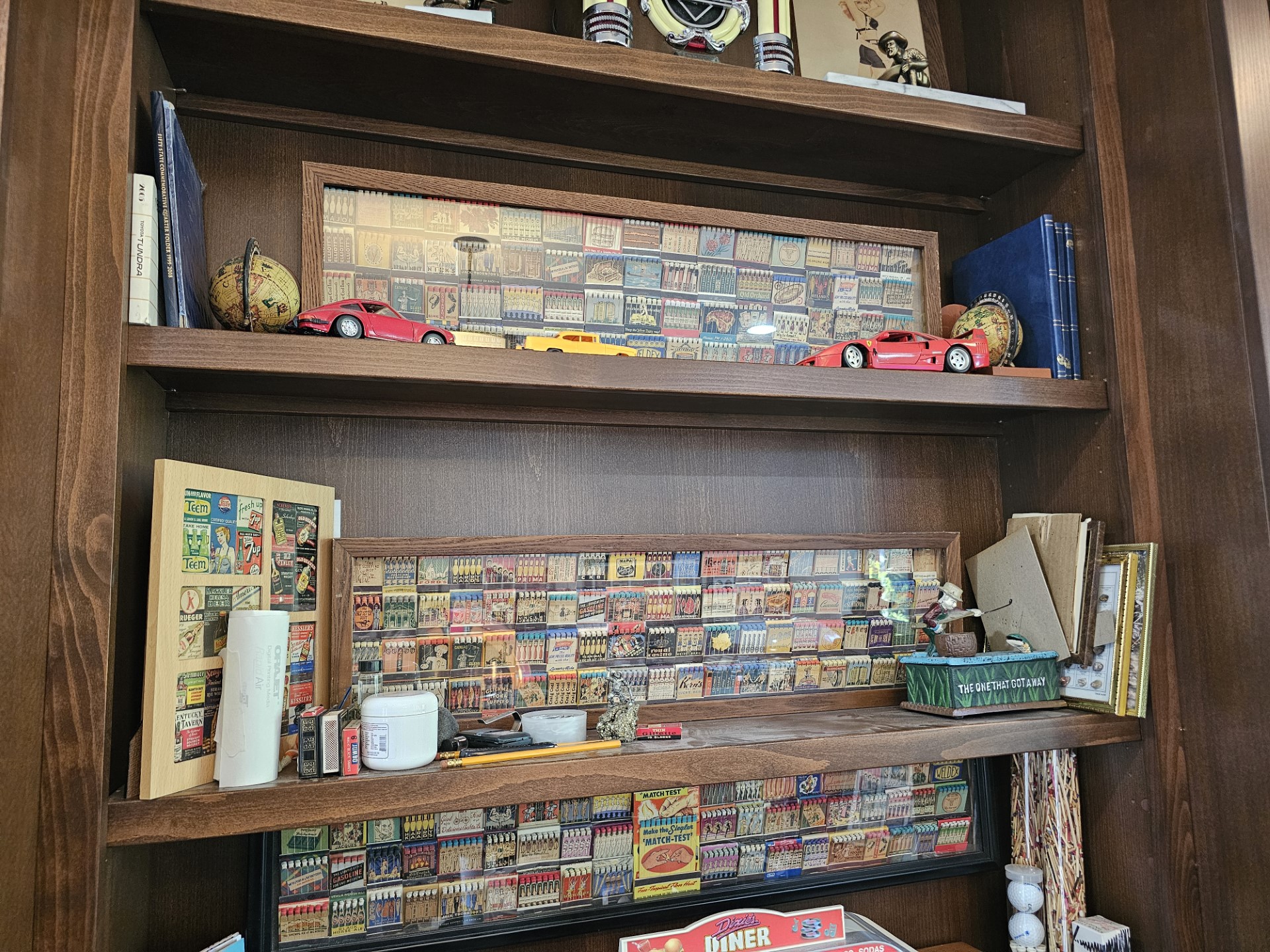
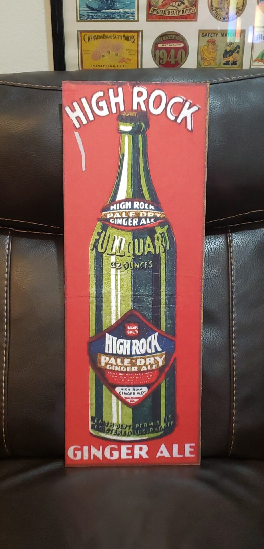
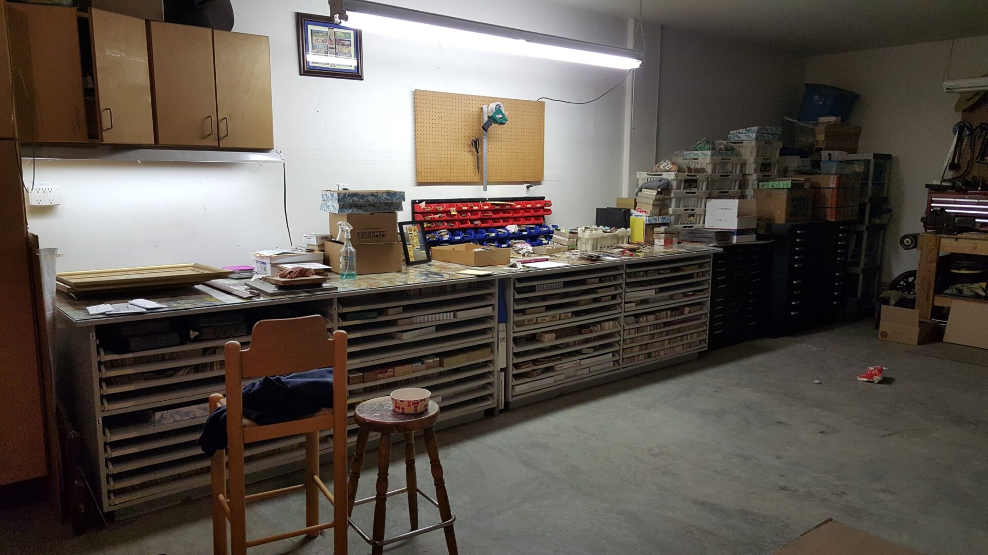
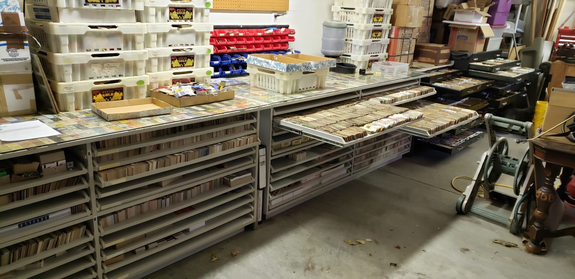
Dave has done beautifully creating a remarkable facility for storing his postcards and matchbooks, with pullout drawers and an enviable organizational system. Atop his workbench, tempered glass lays atop a variety of matchbook covers creating a cool display and a lot of visual pop and eye candy. Dave also frames a lot of his covers and even attends enthusiast events and shows, displaying his collection with other likeminded individuals. Some of his framed collections have been arranged to create art-within-art, so to speak – grouping red, white, and blue covers to create the American flag, for example, or grouping them together to create a star, the options go on and on and the creativity is seemingly endless. Building on the creativity, Dave built a business, www.AtomicMatchStudio.store through which he sells custom, enlarged matchbook framed wall art and many other media re-prints on coffee and beer mugs, handbags, greeting cards, coasters, puzzles, T-shirts, tank tops, hoodies, phone cases, and many other items.
“Through this work, I began calling myself a ‘reartist,’ a guy who restores and appreciates old artwork, bringing them back to life for others to enjoy,” he said.
With art ranging from food and beverage to cafes to hotels to cars to gas stations, there is a little something for everyone. Measuring between 30- to 48-inches wide by 16- to 18-inches high, Dave makes various sizes to accommodate a number of spaces.
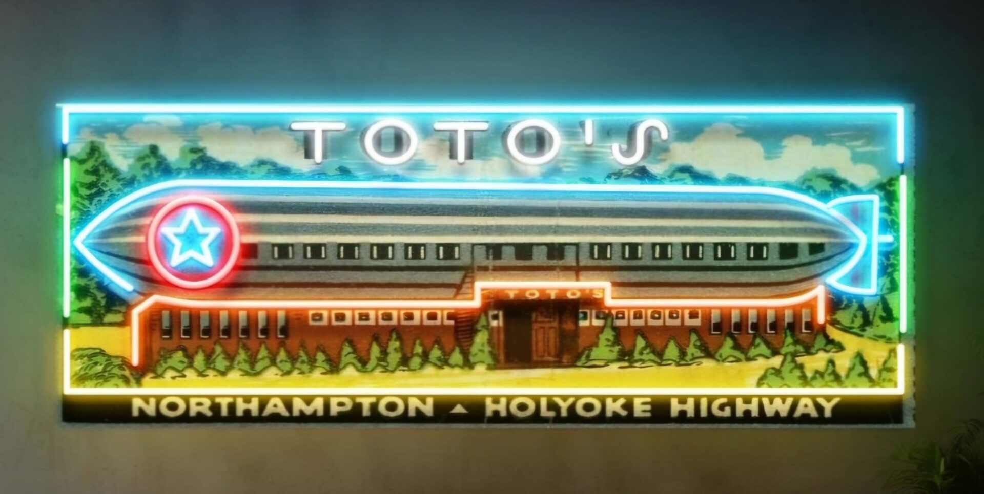
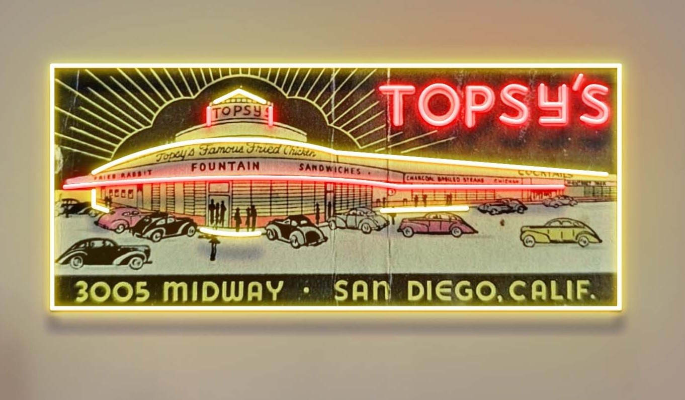
“Most of the art I sell is simple, printed in frame, however, I also offer lighted pieces with LED-neon and backlighting that offer a beautiful glow,” he said.
Currently, there are about 100 on the website that appear to be ready to go, although Dave says about only a half dozen of his pieces are of the lighted variety.
“I think when people see the lighting options in framed backlight vinyl illumination and that with LED neon accents, that’s the way they want to go,” he said. “While the art is gorgeous, the lighting options, of course, make it all pop and it can become a real centerpiece in the home, mancave or she-shed, office, garage, den, or wherever it might be hung.”
Who doesn’t love a good old matchbook cover? Now they can be enlarged and lighted. Learn more on www.AtomicMatchStudio.store or at Dave’s Facebook page, Atomic Match Studio.

